

Every upload, read together. Not file by file.
One report over the whole record — labs, questionnaires and manual entries, read against the person's conditions, medications and history, regenerated with every new result.
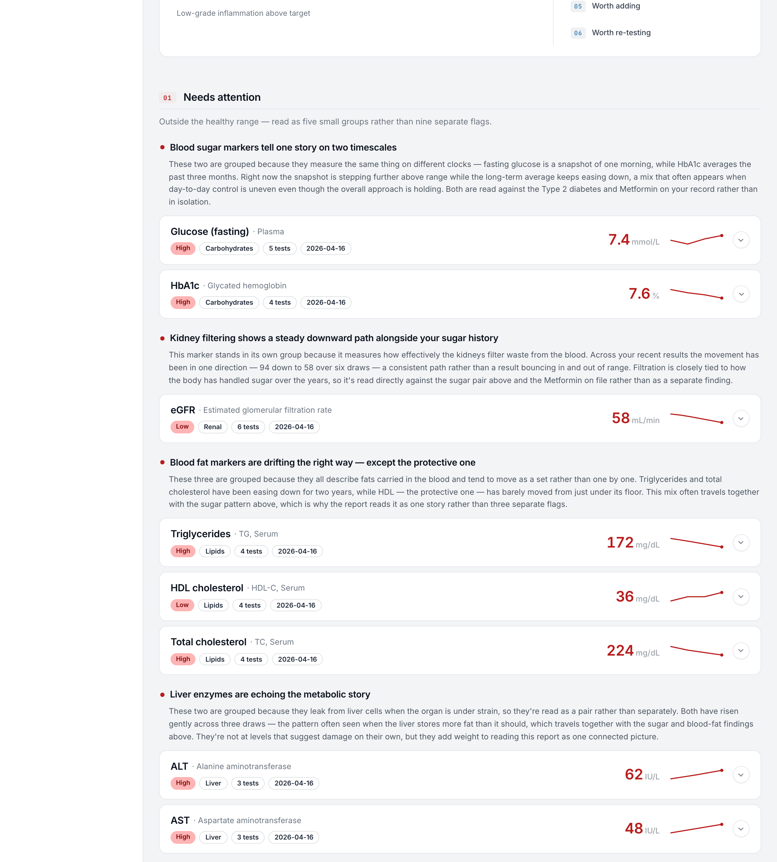
Lab results arrive as flat lists of values against reference ranges. The meaning lives between the values. The Health Report is built to find it.
How markers relate, what the medication list changes, what a borderline result means next to two other borderline results.
How the report reads a record.
Weight of evidence
Labs, questionnaires and manual entries are read as one picture — against the person’s conditions, medications and history, not in isolation.
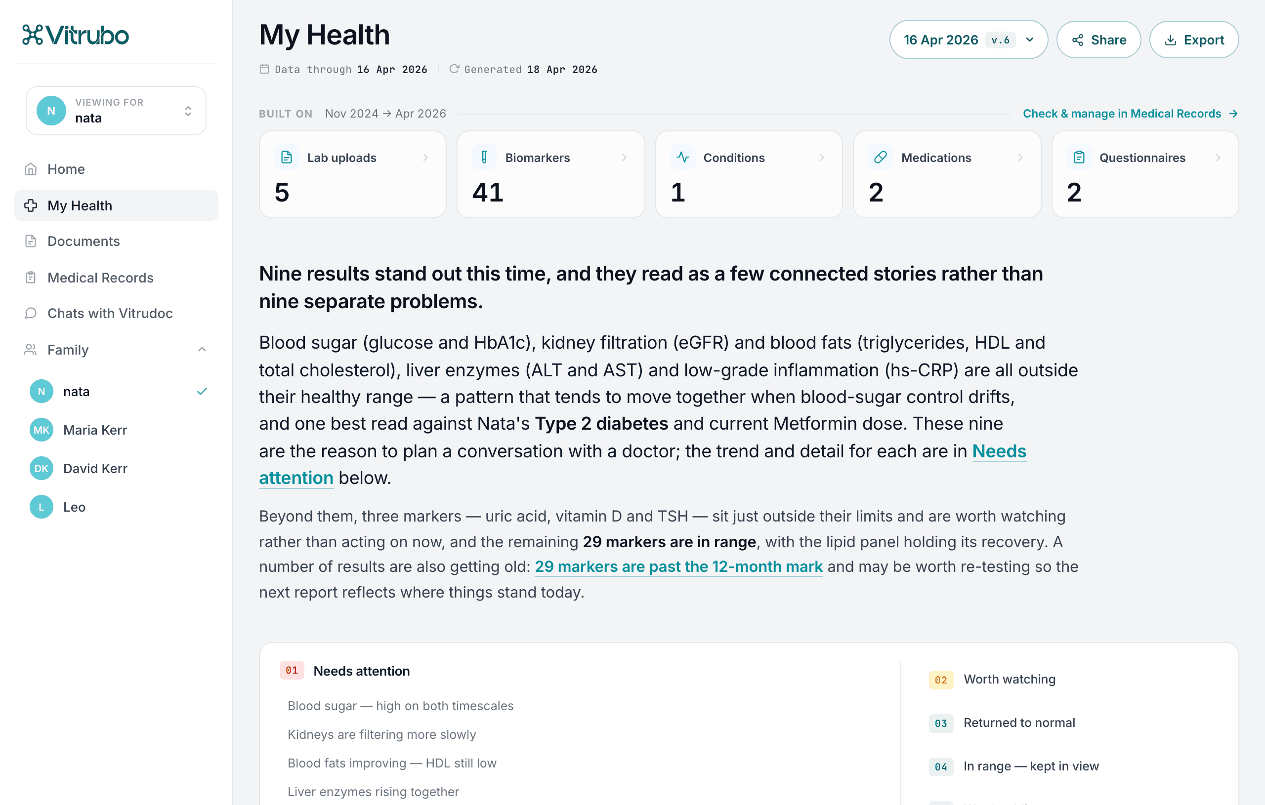
A few connected stories, sorted by urgency
Nine flags become a few connected stories: needs attention, worth watching, returned to normal, worth re-testing.
A new version on every event
Upload a test and the report regenerates — a reason to come back with every result. Previous versions stay as history.
Plain language, next steps
What stands out, why it’s grouped that way, and what to discuss with a doctor.
Four states, in order of attention.
Needs attention
the story to bring to a doctor first
Worth watching
not urgent, kept in view
Returned to normal
back in range as of the latest event
Worth re-testing
measured too long ago to rely on
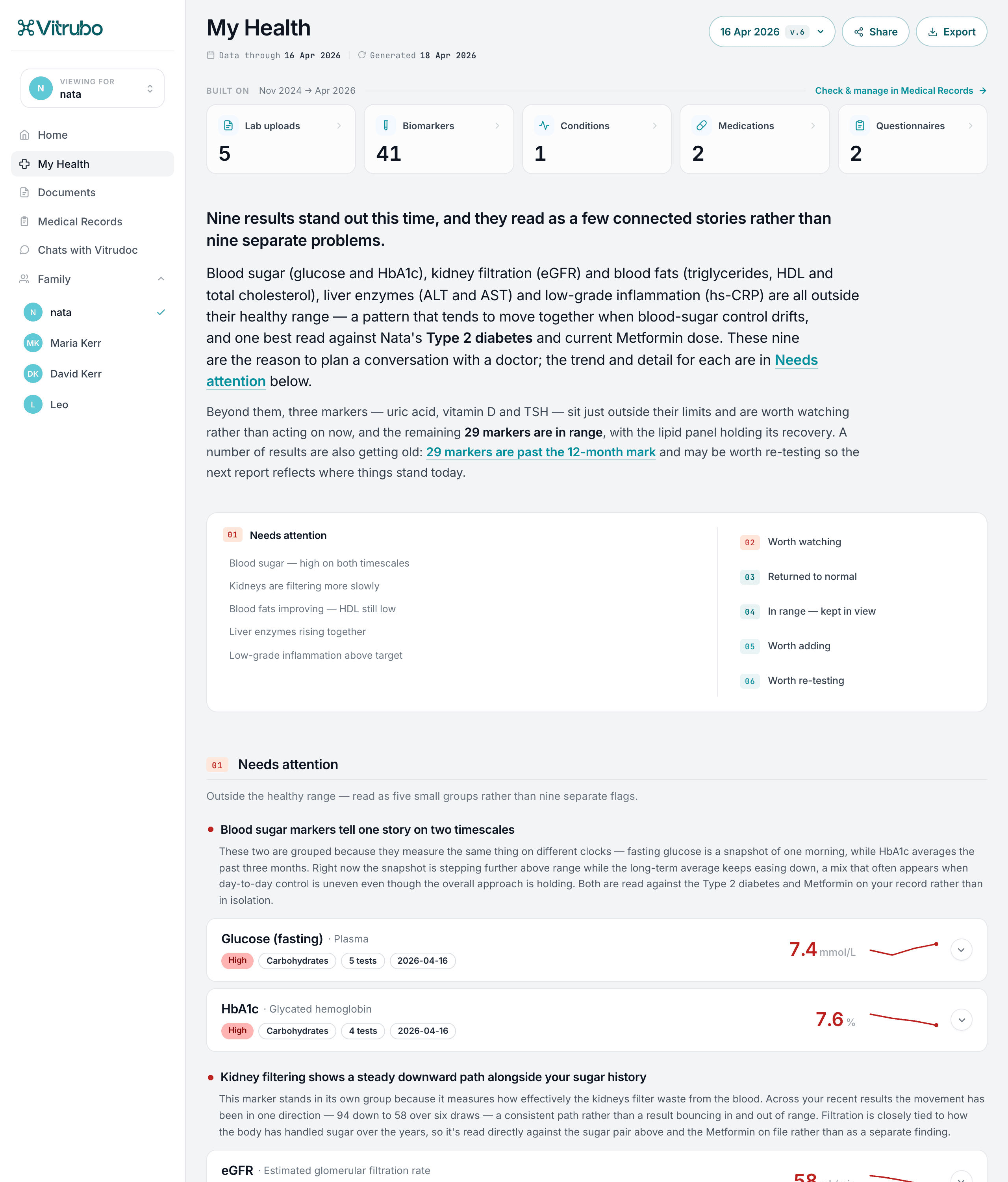
Every biomarker, explained.
Value, trend, plain words
The current value against its range, the trend across draws, and what it means — the guidance it rests on one click away.
One scale across labs
Different labs report different reference ranges and units. Vitrubo normalises them, so draws from different labs read as one trend, not three charts.
Connections on the card
Each card links the markers that explain it — found in the record, or named as missing so the next draw can close the gap.
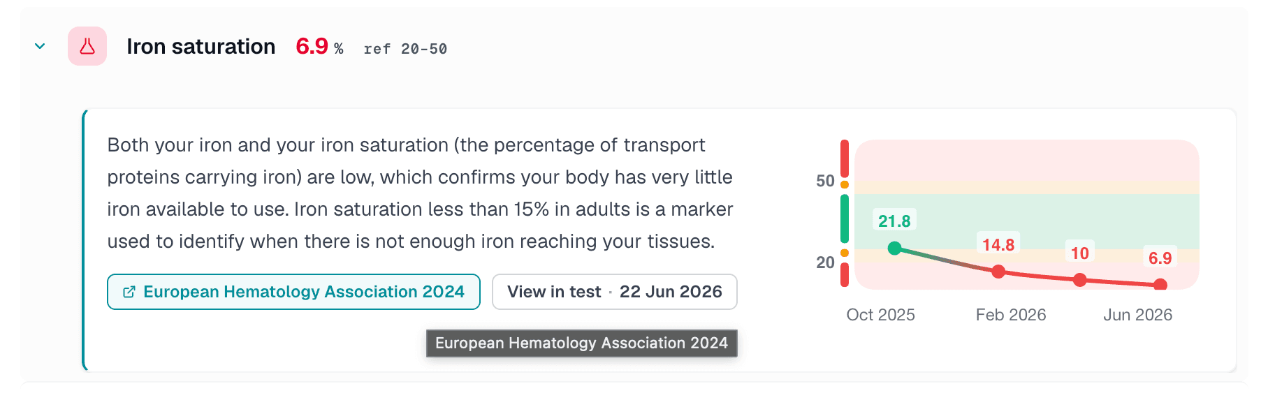
No marker is read alone.
Grouped by what explains what
For every flagged result, the markers that explain it are pulled from the record and grouped: found, or named as missing. Pairings come from medical guidance, not model intuition.
Checked for freshness
A supporting value can be too old to lean on. Every connection carries its relevance window: in window, with a caveat, or past it.
Tests to consider
Markers not on file that would sharpen the picture — and values worth re-testing — raised with the reason attached.
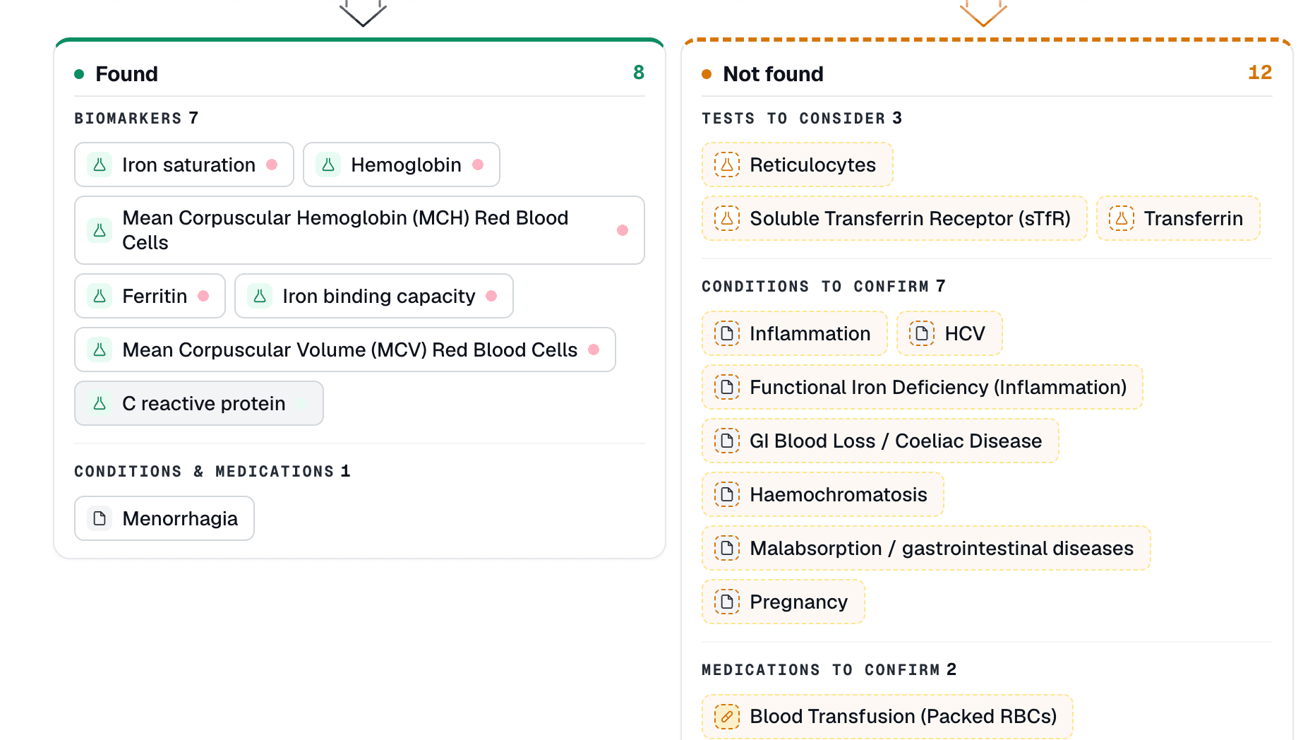
Across years and labs, on one line.
Different labs, different units — one clean trend. Values are normalized to one standard (17,000+ LOINC codes), so history reads as a single line, not a folder of formats.
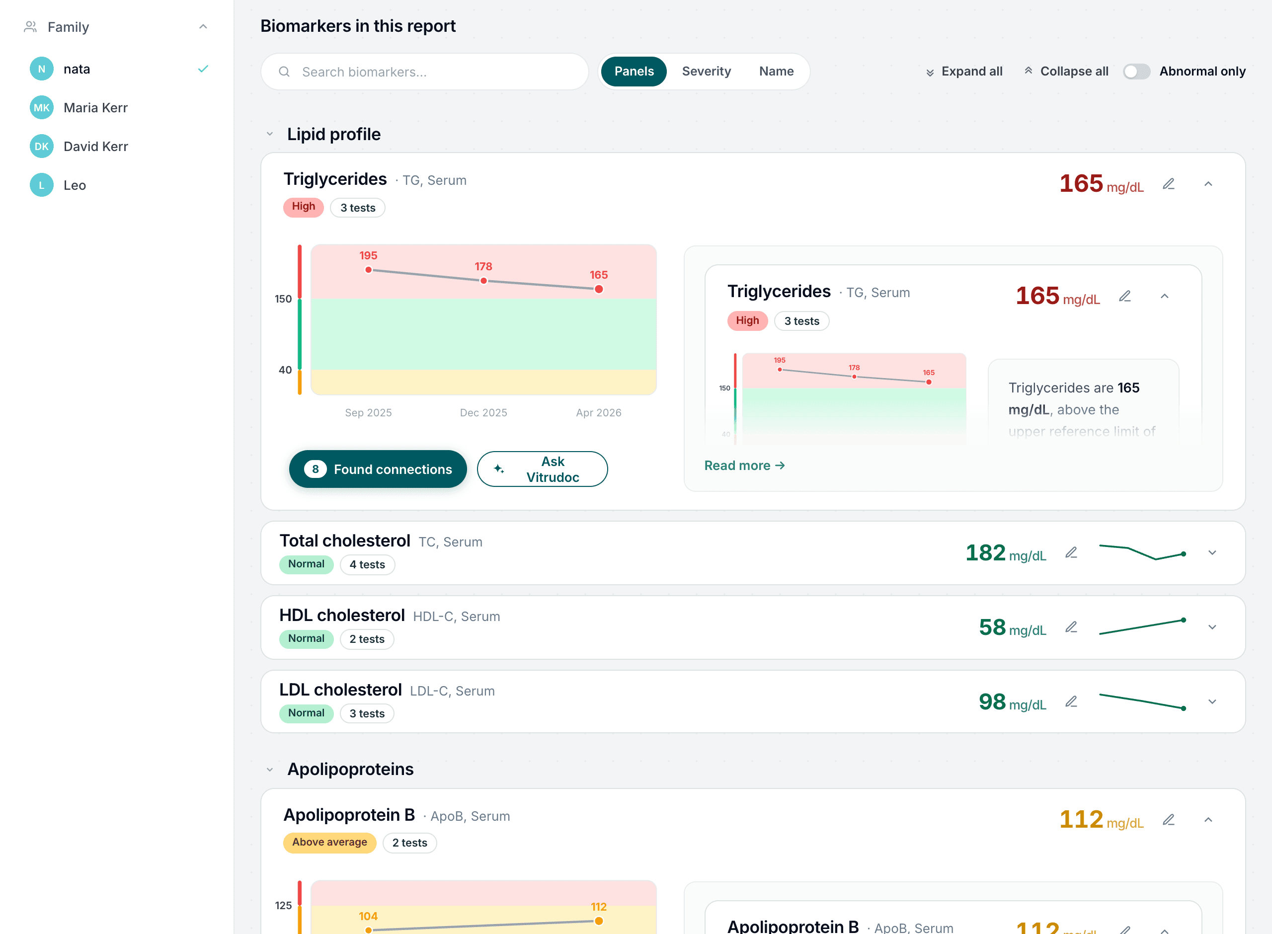
A new version on every event.
Every upload regenerates the report; previous versions stay as history. For a partner product, that is a reason for users to come back with every result.
Same analysis, two readings.

Patient view
Plain language. What it means and what to do next.
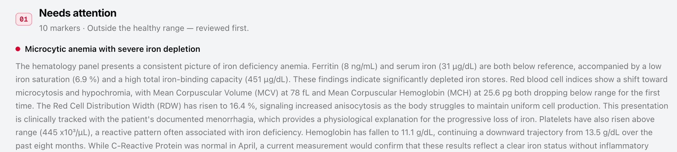
Doctor view
Clinical terminology. Full reasoning behind each observation.
Same interpretation underneath, shown at two depths — a View as: Patient / Doctor switcher sits inside every report.
See the doctor viewNo diagnosis. A clear next step instead.
The report does not diagnose and does not select treatment. It shows what stands out, why, and what to discuss with a clinician — the reasoning is visible and auditable, and the conclusion stays with the human.
Let's look at a demo profile.
Emily Carter · 34 · five visits over nine months. A dozen scattered deviations, read as one coherent story — side findings not over-attributed, stale results flagged as out of date. Inside, a View as: Patient / Doctor switcher shows both depths.
Questions we get first.
Lab panels — blood, urine, allergy — arrive as values; hospital records, prescriptions and notes are parsed as context for every interpretation.
Every statement links to the clinical guideline it rests on; source chips open the actual publication.
The report regenerates as a new version; previous versions stay as history.
Let's talk.
A walkthrough on your own documents, and the report they become.